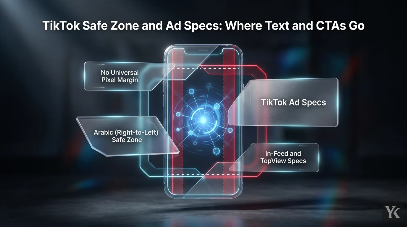
The TikTok safe zone is the part of a 9:16 ad that TikTok's buttons, caption and username don't cover. Build at 1080 x 1920 px. TikTok's in-feed spec page gives the safe zone only as downloadable template files, not pixel figures, and independent readings of the standard vertical file (Socialync, Upload-Post) put the margins at 240 px top, 660 px bottom and 120 px on each side. Inside them you get a box of about 840 x 1020 px, minus its lower-right corner: from 840 px down, the profile picture, like, comment, save and share buttons cover about 300 px in from the right edge.
That box is a starting point, not a fixed rectangle. TikTok says the safe area changes with the aspect ratio, shrinks as the ad caption gets longer, and changes again with anchors or interactive add-ons. A creative that clears the basic 9:16 spec can still put your logo, price or CTA under a UI element once the final caption is in place.
What Is the TikTok Safe Zone?
The TikTok safe zone is the area of the frame where key creative elements, text, logos, product identifiers, and CTAs, are least likely to be covered or cropped by TikTok's interface. Fixed For You Page UI elements, including the profile icon, username, caption area, share buttons, and sound label, sit in predictable positions. If your headline or product shot lands in those positions, the interface wins and your message loses. TikTok's own spec pages warn that text and logos outside the safe zone may be covered or cropped.
No Universal Pixel Margin
There is no single margin that applies to every TikTok ad. The 240 / 660 / 120 px figures above (12.5% top, about 34% bottom and about 11% per side if you build at another size) describe one configuration, a standard vertical in-feed ad, so treat them as a starting point. Square and horizontal assets and ads with anchors each have their own TikTok template file: download the one that matches your asset, then check the result in the ad preview.
TikTok's own add-on pages show how far the numbers move. Its Download Card and Display Card diagrams, drawn on a 540 x 960 frame, keep 126 px clear at the top and 60 px on each side, leave 320 px (Download Card) or 370 px (Display Card) at the bottom, and reserve 120 px on the right from 180 px down. At 1080 x 1920 that right-hand column starts 360 px from the top, not 840 px, so with a card in the ad keep logos and prices out of the right-hand 240 px from there down.
Arabic (Right-to-Left) Safe Zone
For Arabic creative in MENA, don't reuse the standard template. TikTok's in-feed spec page publishes separate Arabic right-to-left safe-zone files, with and without anchors, and says every region except the Arabic region should use the standard left-to-right file; the TopView safe-zone pack also comes in separate left-to-right and right-to-left versions. Check your layout against the RTL file itself rather than flipping the standard one, and expect the CTA button label to follow the viewer's app language: TikTok's reservation spec pages say CTA text is auto-translated, with English as the fallback.
TikTok Ad Specs
Before talking about layout, get the technical foundation in order. TikTok's creative best practices ask for vertical 9:16 video, at least 720p resolution, and sound or music. Build the 9:16 master first. Only adapt to square or horizontal when a placement requires it, and re-check the safe zone after any reformatting, because the safe area changes with the dimension.
In-Feed and TopView Specs
These are the non-Spark specs from TikTok's auction in-feed spec page and its TopView spec page:
| Spec | Auction In-Feed | TopView |
|---|---|---|
| Ratio and minimum size | 9:16 (recommended): 540 x 960 px; 16:9: 960 x 540 px; 1:1: 640 x 640 px | 9:16 only: 540 x 960 px |
| File types | .mp4, .mov, .mpeg, .3gp, .avi | .mp4, .mov, .mpeg, .3gp |
| Max file size | 500 MB | 500 MB |
| Video length | Up to 10 minutes on the spec page; 5 to 60 seconds in the ad format policy | 5 to 60 seconds, 9 to 15 recommended |
| Bitrate | 516 kbps or higher | 2,500 kbps or higher |
| Ad caption | White, fixed font; no links, @ mentions or hashtags | Max 100 characters; white, fixed font |
| Display name | One line, max 20 characters (10 in Chinese, Japanese or Korean); app ads use the App Store or Google Play name | One line, max 20 characters (10 in Chinese, Japanese or Korean); 4 to 10 recommended |
| Profile photo | 98 x 98 px, .jpg, .jpeg or .png, under 50 KB; key element in the central 66 x 66 px | Same as in-feed |
The two TikTok pages disagree on auction video length (the ad format policy still says 5 to 60 seconds), so confirm that anything over 60 seconds uploads and passes review before you build around it. The auction page gives no recommended length; TikTok's creative guidance focuses on the opening instead and asks for the hook in the first 6 seconds.
Caption length matters for the safe zone too. On TikTok's reservation spec pages, captions show at most four lines before a "See more" cut, and TikTok suggests staying within 100 characters (50 in Chinese, Japanese or Korean) to avoid it.
Caption and Landing Page Consistency
Safe-zone compliance is only one part of getting an ad approved and performing. TikTok's ad format policy requires the ad caption, ad text, images, video and CTA to be consistent with the promoted product or service on the landing page, and the caption to match the video. One of its own examples of a violation is an image promising 30% off next to a caption promising 50% off. A CTA that promises a discount the landing page does not honor is a policy problem, not just a UX problem.
Landing pages also have to work. The same policy rules out pages that are expired or under construction, incomplete, not mobile-friendly, or that make viewers download something or enter personal information before they can see the main content.
Where to Put Text
The practical hierarchy for text placement starts with one rule: keep everything that carries meaning inside the safe zone. Decorative elements can sit near the edges. Anything that explains the offer cannot.
A few placement principles that hold across formats:
- Place the primary message in the central-to-upper-middle portion of the frame, where it stays readable without competing with bottom controls.
- Keep logos and product identifiers inside the safe-zone guide, not at the extreme top, bottom, or side edges.
- Use large, high-contrast text. Mobile screens are small and TikTok's feed moves fast.
- Avoid a white or transparent background. TikTok's account name, caption and icons are white and can disappear against it.
- Treat subtitles and on-screen text as separate layers. Both must be readable when the ad plays without sound.
- Avoid placing essential information over areas occupied by captions, buttons, anchors, profile elements, or skip controls.
Text That Never Sits Near Edges
Some elements have zero tolerance for edge placement. If any of these are outside the safe zone, the ad is broken as a communication asset even if it passes review:
- Brand name and logo
- Product name
- Price and discount percentage
- Promotional deadline or limited-time language
- Legal qualifier or required disclosure
- App-store instruction or download prompt
- The only explanation of what the offer actually is
Move a logo inward if it sits near the TikTok logo or other fixed interface elements. Move discount language away from the bottom if the CTA, caption, or anchor may cover it. Disclaimers need to be large enough to read; a tiny edge-aligned line does not satisfy the intent of a disclosure.
In-Video CTA vs. Platform Button
This distinction matters. An in-video CTA is text you design into the creative, something like "Shop now" or "Get 20% off today" rendered as part of the video. TikTok's platform CTA is the button TikTok renders over the ad, which the viewer actually taps.
These are two different things and they need to work together, not compete. The in-video CTA should reinforce the platform button's message and sit inside the safe zone. It should not imitate the platform button so closely that viewers ignore the actual tappable element. TikTok's rules point the same way: its Reservation In-Feed spec says the creative must not mimic the TikTok interface, and its ad format policy rejects text or gestures for actions the ad doesn't support, such as telling viewers to swipe up.
TikTok's platform CTA has constraints you cannot override. On Reservation In-Feed ads you can't write your own CTA text: non-video-view ads must use one of TikTok's standard CTAs, and the default is "Learn more." For TopView, the CTA background color is automatically matched with the video creative and cannot be customized. Design your in-video creative knowing that you may not control the button's label or color.
CTA Placement for Production
Keep the in-video CTA near the main message, not pressed against the lower interface area. Action language should be visually obvious and concise. A few rules worth putting in the brief:
- Do not place the only CTA outside the safe zone.
- Do not assume the platform button appears in the same position across every placement or device.
- Do not design around a custom CTA color where TikTok controls the button styling.
- Match CTA wording to the destination. Product pages, lead forms, app downloads, and content destinations create different expectations and should be named differently.
- Test the ad with the selected CTA, caption length, anchor, and interactive add-ons enabled before final approval.
Captions and Add-Ons Change Everything
TikTok is direct about it: the longer the caption, the smaller the safe zone. A design that works with a three-word caption may fail after the copywriter adds a full sentence of promotional language, and anchors or interactive add-ons bring more UI into the frame.
The workflow that prevents this:
- Finalize or closely approximate the ad caption before exporting the creative.
- Select the exact placement and format, including any anchors or interactive add-ons.
- Download the matching TikTok safe-zone file for that configuration (standard or anchor, left-to-right or Arabic right-to-left).
- Place the guide above the creative during layout review.
- Check every headline, logo, CTA, subtitle, price, and disclaimer against the guide.
- Preview the ad and repeat the check on more than one device or screen size where possible.
The failure to avoid: the video is finalized before the caption is written, then a longer caption goes in and no one re-checks the layout.
TopView: Two Safe Zones, Not One
TopView ad specifications describe a two-stage experience. The first stage is an initial three-second open-screen takeover. The second stage transitions into an in-feed video experience. A creative can be safe in one stage and compromised in the other, which is why both safe-zone guides need to be checked separately. TikTok notes that the in-feed stage is the more restrictive of the two.
During the first three seconds, TikTok won't accept logos or key messages that overlap the TikTok logo, the skip button, or the swipe-up-to-skip link.
Practical steps for TopView production:
- Create a separate opening-frame review for the first three seconds before reviewing the rest of the video.
- Check the transition from open screen to in-feed rather than reviewing only the final frame.
- Use the placement-specific safe-zone files TikTok supplies for TopView, not the standard in-feed files.
TopReach, TikTok's format combining TopView and TopFeed for tentpole moments and launches, adds another layer. If you are running TopReach, confirm which safe-zone files apply to each component of the placement.
The safe-zone discipline required for TopView is the same principle that applies to Meta placements, just with different UI positions. Meta Ads Safe Zones covers the same concept for Meta if your team runs both platforms.
Common Mistakes
| Mistake | What to Do Instead |
|---|---|
| Using one fixed template for every placement | Use the placement, dimension, caption, and add-on-specific guide |
| Headline at the top or bottom because it looks clean in the editor | Review against TikTok's UI and keep the essential message inside the guide |
| Checking only the video file and ignoring the caption | Use the final or expected caption; longer captions reduce the safe zone |
| Assuming the CTA button can be styled or renamed freely | Confirm which CTA options and styling controls are available for the selected format |
| Designing for a static preview only | Review motion, transitions, the opening seconds, and device-specific presentation |
| Relying on text alone to communicate the offer | Use clear product demonstration, sound or music, and a landing page that fulfills the CTA promise |
TikTok's auction in-feed documentation notes that the preview may differ slightly from the live version because it is not device-specific. That is not a reason to skip the preview, but it is a reason not to treat a clean preview as a guarantee.
Testing Before Launch
Running two or three layout variations before committing to a final export costs less than discovering a covered headline after a campaign goes live. The testing does not need to be elaborate.
Create at least two versions with different headline locations inside the safe zone. Test a concise caption against the full production caption to see how much the safe area changes. Where interactive add-ons are relevant, test with and without them. Compare an in-video CTA placed near the main product demonstration with one positioned closer to supporting copy.
Check readability with sound off and on. TikTok's ad policy requires audio, but subtitles and on-screen text should still carry the message for anyone watching muted.
The question to answer before sign-off: can a viewer identify the product, the benefit, and the next action without relying on any text that might be covered by the interface?
TikTok Spark Ads add another variable. A Spark Ad runs an existing organic post (the brand's own or a creator's), and TikTok's Spark Ads page says the ad's display name and caption come from that post and can't be edited in Ads Manager. TikTok shows up to four lines of that caption, so check the safe zone against the post's real caption, not the short one you would have written for a standard ad. TikTok Spark Ads covers the authorization and setup side of that format.
Production Template
Use this as the creative brief or QA handoff document for any TikTok ad:
Placement: _______________ Aspect ratio: _______________ Minimum resolution: _______________ Final or estimated caption length: _______________ Interactive add-ons or anchors: _______________ Safe-zone file used (standard or anchor, LTR or Arabic RTL): _______________ Primary message: _______________ Product and logo location (relative to safe zone): _______________ In-video CTA wording: _______________ Platform CTA selection: _______________ Landing-page URL and promise: _______________ TopView opening-screen review completed: Yes / No / N/A Preview approved: Yes / No Sound-off readability confirmed: Yes / No Device and readability checks completed: Yes / No
Keep the guided review file, not just the clean export. If a placement is flagged during QA or after launch, the guided file shows exactly what was checked and what was missed.
Frequently Asked Questions
What exactly does the TikTok safe zone cover?
The TikTok safe zone is the portion of the frame where text, logos, and CTAs are unlikely to be covered or cropped by TikTok's interface elements, including the profile icon, caption area, share buttons, and sound label. For a standard vertical in-feed ad at 1080 x 1920, independent readings of TikTok's template put it inside 240 px from the top, 660 px from the bottom and 120 px from each side, with the right-hand buttons also covering the lower right of that area. Elements outside it risk being obscured in the live ad, even if they appear visible in the design file.
Does the safe zone change with a longer caption?
Yes. TikTok states directly that longer captions reduce the available safe area. A layout that works with a short caption may have covered elements once the full production caption is added. Always finalize or closely approximate the caption before completing the layout review.
Is the safe zone the same for TopView and in-feed ads?
No. TopView has two stages: an initial three-second open-screen takeover and a transition to an in-feed experience. Each stage has its own safe-zone requirements. Logos and key messages must also stay clear of the TikTok logo, skip button, and swipe-up-to-skip link during the first three seconds. Both safe-zone guides need to be checked separately.
Can I customize the CTA button color and label on TikTok ads?
It depends on the format. On Reservation In-Feed ads you can't write custom CTA text: non-video-view ads use one of TikTok's standard CTAs, and "Learn more" is the default. For TopView, the CTA background color is automatically matched with the video creative and cannot be customized. Check the specifications for your specific placement before designing around a custom button style.
Why does my TikTok ad preview look fine but the live ad has covered elements?
TikTok's auction in-feed documentation notes that the preview may differ slightly from the live version because it is not device-specific. The preview is a useful check but not a guarantee. Review the layout against the downloadable safe-zone file for your placement and caption length, and where possible check the live ad on more than one device.
Digital Marketing Technologist
Yosef Kassabry is a media buyer and full-stack developer with 11+ years in paid acquisition for Arabic-speaking audiences across MENA and the Gulf, and more than $10M in managed ad spend. He runs paid media through direct buys and affiliate networks, builds his own tools, and writes about ad platforms, tracking, native ads and affiliate marketing.